
Tag: User Experience

  • Fourth-Quarter Marketing for Experience Venues: How to Fill the Calendar Before Your Busiest Season

    Fourth-Quarter Marketing for Experience Venues: How to Fill the Calendar Before Your Busiest Season

    An experience venue does most of its fourth-quarter business on decisions that are being made right now.

    Office holiday parties get assigned to someone in late September and early October. Grandparents start asking what the kids would actually use. Group organizers begin shortlisting places for a December night out while there is still a choice of dates. By the time the season arrives, most of that decision-making has already happened somewhere a venue either did or did not appear.

    That timing is what makes the fall different from the rest of the year. Marketing done in December competes for bookings that were settled in October. Marketing done in October shapes which venues make the shortlist at all.

    This guide covers what to put in place over the next few weeks: the pages, the assets, the listing work and the ad spend that turn a busy quarter into a fully booked one. It applies to indoor golf, axe throwing, escape rooms, mini golf, breweries and event spaces, anywhere the product is the visit itself.

    Work backwards from the booking, not the season

    Most venue calendars have a lead time the marketing calendar ignores.

    A walk-in decides in minutes. A group of eight friends decides over a few days. A corporate holiday party is decided weeks ahead by someone who needs to confirm a budget, a date and a headcount before they can book anything. Those three customers need to be reached at completely different moments.

    Write down the real lead time for each booking type the venue sells. Ask the staff who answer the phone. Look at the gap between the enquiry date and the event date in existing records. A pattern usually appears quickly: parties booked two to five weeks out, corporate groups six to ten weeks out, walk-ins the same day.

    Then set the promotion dates from those numbers rather than from the calendar. If corporate parties need eight weeks, the corporate page and the corporate ads need to be live in early October for a first week of December event. Publishing that promotion on December 1 reaches an audience that has already booked somewhere else.

    The promotion goes live one full lead time before the date it is selling.

    This one rule fixes more fourth-quarter revenue than any change to a headline.

    Market to the organizer, not the participant

    For group bookings, the person searching is rarely the person most excited to go.

    They are the one who got handed the job. They need to choose somewhere that will not embarrass them, confirm it will work for a specific number of people, understand the cost before proposing it to anyone else, and get it booked without a long back and forth. Their risk is not a boring evening. Their risk is being responsible for a bad one.

    Copy written for the participant sells the experience: the thrill, the atmosphere, the competition. Copy written for the organizer answers the questions that let them commit:

    • How many people can you take at once
    • What does it cost per person, or as a package
    • How long does it take
    • Is there food and drink, and can it be arranged in advance
    • Can the group have a private space
    • Is it suitable for mixed ages or mixed ability
    • What happens if the headcount changes
    • How and when do you need payment

    Atmosphere still matters, and photography carries most of it. The words should carry the logistics. A page that does both converts an organizer who arrived cautious.

    Give each occasion its own page

    A birthday party and a corporate holiday party can happen in the same room on the same equipment and still be two entirely different products.

    The budgets differ. The decision-makers differ. The questions differ. The search terms differ. A single “Groups and Events” page that tries to serve both tends to rank for neither and speaks specifically to nobody.

    Build a page per occasion the venue genuinely wants more of. For most experience venues heading into the fourth quarter, that means:

    • Office and corporate holiday parties
    • Birthday parties, often split between kids and adults
    • Gift cards
    • New Year’s bookings
    • Larger private buyouts

    Each page needs its own headline, its own photography, its own package and pricing information, and its own enquiry form with fields that match that booking type. A corporate form should ask for a company name, a headcount range and a preferred week. A kids’ party form should ask for an age range instead.

    These pages are also the destination that makes paid traffic worth buying. Sending a holiday party ad to a homepage asks the visitor to find the relevant information themselves, and a good share of them will not. This is the same handoff logic described in our guide to a connected local marketing system: every channel needs somewhere specific to send people.

    Make the enquiry survive a phone screen

    Group enquiries for experience venues arrive overwhelmingly from phones, often in the evening, often while the organizer is doing something else.

    That has practical consequences for the booking path. A form that requires pinch-zooming gets abandoned. Fourteen required fields get abandoned. A date picker that fights a thumb gets abandoned. A phone number that is not tappable gets copied incorrectly or forgotten.

    Test the whole path on an actual phone, on mobile data rather than the venue’s wifi, from the first ad click to the confirmation message. Watch for the specific failures that cost bookings:

    • Prices or package details hidden inside an image that renders too small to read
    • Forms that lose everything the visitor typed when validation fails
    • Required fields an organizer cannot answer yet, such as an exact headcount
    • No confirmation screen, so the visitor does not know whether it sent
    • A booking system that opens in a new tab and loses the branding
    • Labels missing from form fields, which also breaks the page for anyone using a screen reader. The W3C explains the requirement in its guidance on form labels and instructions.

    Speed matters here too, because an evening mobile visitor has very little patience for a page that stalls. The Core Web Vitals guidance on web.dev covers how loading, responsiveness and visual stability are measured from the visitor’s point of view.

    Then decide what happens after the form arrives. A response within a few hours during the fourth quarter is a competitive advantage, because the organizer is usually contacting more than one venue and the first useful reply often wins.

    Shoot the season before you are in it

    Seasonal marketing needs seasonal photography, and the window to capture it is short.

    A holiday promotion built from summer photos looks borrowed. Worse, most venues try to fix this in December by photographing a live event, which produces rushed phone images of a night nobody had time to style.

    The alternative is to plan one shoot per quarter, scheduled deliberately on a night that looks the way the venue wants to be seen: full, lit, in use, with the food and drink present. For the fourth quarter that means holiday dressing, a catering spread, a corporate group in the space and a gift card in frame.

    One planned shoot produces the images for the season’s ads, social posts, occasion pages, email and gift card artwork. It also prevents the most common visual problem on venue websites, which is a gallery assembled from whatever happened to be photographed over three years at wildly different quality levels.

    Shoot for the formats the content will actually use: vertical video for social, wide crops for page headers, clean product shots for gift cards, and at least a few images with visible people rather than empty rooms. An empty room shows the facility. A busy room sells the night.

    Treat the Google listing as a booking page

    For a venue, the Google Business Profile is frequently the first and sometimes the only page a customer sees.

    Someone searching for a place to take a group looks at the photos, the rating, the hours and the phone number, then decides whether to click through at all. That makes the listing a booking surface rather than a directory entry.

    Going into the fourth quarter, get the details right before the traffic arrives:

    • Holiday hours, including closures and late openings, entered in advance
    • Photos refreshed from the new shoot, with the interior clearly represented
    • Attributes and services that match what the venue actually offers to groups
    • A booking or enquiry link pointed at the relevant page, not the homepage
    • Questions and answers seeded with the real logistics organizers ask about
    • Posts covering the seasonal offers while they are live

    Structured data on the website helps search engines connect the listing to the site. Google documents the relevant markup for venues in its guidance on local business structured data.

    Venues that draw from several surrounding communities have an additional problem worth reading about separately, which our guide to local SEO for service-area businesses covers in detail.

    Collect reviews while the room is happy

    Reviews do specific work for an experience venue. They tell an organizer that a group like theirs had a good time, and they answer the question no marketing page can answer credibly, which is whether the visit lives up to the photos.

    The fourth quarter is the best review-collection window of the year, because volume is high and the visit is memorable. It is also the easiest one to waste, because staff are busy.

    Build the request into the operation rather than leaving it to good intentions. That usually means a short link or QR code the team can hand over at the end of the visit, a follow-up message sent the next morning while the experience is fresh, and a habit of asking the group organizer specifically, since their review is the one future organizers will read most closely.

    Reply to every review, including the difficult ones. A calm, specific reply to a complaint reassures the next reader more than a wall of five-star ratings with no owner presence at all.

    Put paid budget where the intent already exists

    Fourth-quarter advertising for a venue does not need to create demand. The demand is already there and already searching. The job is to be present at the moment of comparison.

    Three campaign types earn their place for most venues:

    1. Search, on occasion terms. Phrases built around the occasion and the area, pointed at the matching occasion page. This is the highest-intent traffic a venue can buy, and it is usually cheapest before the season peaks.
    2. Retargeting, always on. Group organizers research across several sessions and several days. Retargeting keeps the venue in the consideration set through a decision that is rarely made in one sitting.
    3. One seasonal promotion. A single clear offer with a deadline, supported by the quarter’s photography and a page built for it.

    Budget follows the lead time. Corporate campaigns should ramp in October and taper as the available dates fill, because spend on a fully booked week is wasted. Gift card campaigns do the opposite and peak in the final ten days before the holidays, when late buyers are looking for something to give.

    Keep the offer in one place. When the ad, the page and the listing disagree about the price, the organizer stops trusting all three.

    Sell gift cards as a second product

    Gift cards solve a real problem for an experience venue, which is that the fourth quarter has more demand than the calendar has capacity.

    A gift card converts interest that cannot be seated in December into revenue now and a visit in January or February, which is often the quietest stretch of the year. It also reaches a buyer the venue cannot otherwise sell to: someone who is not coming, has never visited, and simply needs a good gift.

    Treat it as a product rather than a footnote. It needs its own page, a purchase path that works in a few taps on a phone, artwork that looks like a gift, and clear information about how the card is delivered and redeemed. Digital delivery matters most in the final week, when the buyer needs something that arrives immediately.

    Then plan the redemption. A stack of unredeemed cards in January is an opportunity, and a reminder sent in the slow season converts them into visits during the weeks that need the traffic.

    Answer the questions that stall a group booking

    Every venue has a list of questions the staff answer on the phone several times a day. Each one is a question the website could have answered before the organizer had to ask.

    Gather that list from whoever handles enquiries, then answer the questions in plain language on the relevant occasion page. Common ones for experience venues include parking and accessibility, whether outside food or cake is allowed, minimum and maximum group sizes, what happens with a late arrival, whether the space can be private, age restrictions, deposit and cancellation terms, and how long to allow for the whole visit.

    This is not only a service improvement. Unanswered logistics are a leading cause of abandoned enquiries, because an organizer who cannot confirm that a venue works for their group will quietly move to one that made it obvious.

    Measure bookings, not reach

    Reach and impressions describe activity. A venue needs to know whether the calendar filled.

    Track the small number of measures that connect marketing to revenue:

    • Enquiries and completed bookings by occasion type
    • Calls from the website and from the Google listing
    • Cost per booked group, by campaign
    • Gift card sales, and redemptions in the following quarter
    • Average group size and average value per booking
    • Response time to enquiries, and the share that convert
    • Reviews collected per hundred visits

    Review these by occasion rather than in aggregate. A corporate booking and a walk-in should never be judged by the same cost per enquiry, because they are not worth the same amount. The purpose of the reporting is to answer one question before the next season: which occasions deserve more of the budget, and which pages are getting in the way.

    What this looked like for Digital Golf Fort Erie

    Digital Golf Fort Erie is an indoor golf venue in Fort Erie that sells casual bookings, leagues, group experiences and birthday parties.

    The starting position was a common one for an experience venue. The facility was good, the website could not take a party enquiry cleanly, and the business had no review presence at all, which meant a first-time visitor comparing options had nothing to reassure them.

    The work concentrated on the booking path and the local visibility around it: a rebuilt website with a dedicated birthday party page, a booking form that works on a phone, an on-location photoshoot that produced real images of the space in use, a social calendar built from those images, Google Ads pointed at the pages that sell a specific occasion, and a review strategy the team could actually run during a busy shift.

    The review count moved from zero to 17 at a 5.0 average, and the highest-performing social post reached more than 13,000 views. The structural change mattered more than either number: enquiries now arrive through a path built for them instead of through a general contact form.

    Read the Digital Golf Fort Erie case study for the full breakdown of the website, social, review and advertising work.

    Fourth-quarter checklist for an experience venue

    Work through this list before the season rather than during it:

    1. Write down the real lead time for each booking type the venue sells.
    2. Set promotion launch dates one full lead time ahead of the dates they sell.
    3. Build a separate page for each occasion worth pursuing this quarter.
    4. Rewrite group copy to answer the organizer’s logistics, not just the atmosphere.
    5. Test the full enquiry path on a phone, on mobile data.
    6. Cut the enquiry form to fields an organizer can answer today.
    7. Book one seasonal photoshoot on a night that looks busy.
    8. Enter holiday hours and refresh the photos on the Google Business Profile.
    9. Point the listing’s booking link at the relevant page.
    10. Put a review request into the end of the visit, and reply to every review.
    11. Run search on occasion terms, retargeting always on, and one seasonal offer.
    12. Give gift cards a real page and a phone-friendly purchase path.
    13. Publish answers to the questions the phone team repeats daily.
    14. Agree how bookings, calls and gift card sales will be tracked before spend starts.
    15. Book the first-quarter shoot before the fourth quarter ends.

    Nobody completes all fifteen in a week. The order above is roughly the order of impact, so the first four items are worth more than the last four if time is short.

    Plan the season while there are still dates to sell

    A venue’s busiest quarter is won in the quiet weeks before it, in the pages that explain a group booking clearly, the photography that makes a night look worth choosing, and the ad spend that shows up while the organizer is still deciding.

    Uncommon works with experience venues on exactly that cadence: one shoot a quarter, a social calendar and ad plan built around the season the venue is actually selling, and a monthly report that reports bookings rather than impressions. See how we approach marketing for experience venues, or talk to the team about the next quarter.
    Plan Your Season
  • How to Turn a Product Catalogue Website Into a Sales Tool

    How to Turn a Product Catalogue Website Into a Sales Tool

    A product catalogue website can hold hundreds or thousands of items and still leave buyers wondering where to begin.

    This usually happens when the catalogue was built around internal product data. Categories mirror the company database. Filters use language familiar to the sales team. Product pages display whatever information happened to be available during upload.

    Customers arrive with a different point of view. They may know the outcome they need, the equipment they already own or the budget they need to stay within. Some have a model number ready. Others are still trying to understand which type of product solves the problem.

    A useful catalogue helps both groups move forward. It connects product data to the way people research, compare and decide while giving every page a job within the larger marketing system. Our guide to building a connected marketing system covers how those pieces support one another; a catalogue is where that system either earns the sale or quietly loses it.

    Decide what the catalogue should help people do

    Begin with the action a qualified visitor should be able to take.

    For a retail business, that action may be adding a product to a cart. A manufacturer might want visitors to request a quote, download technical documentation or find a distributor. Wholesale buyers may need to build an order list before contacting an account representative.

    Several actions can exist across the site. Each product type should still have one clear primary path.

    This decision affects the entire build. Direct-purchase catalogues need pricing, availability and a streamlined checkout. Quote-driven sites require enough technical detail to qualify interest, along with a form that captures the information sales requires. Businesses using distributors need location and territory logic that reliably sends buyers to the right contact.

    Before changing colours or page layouts, document the catalogue’s purpose in a sentence:

    The catalogue helps [type of buyer] identify the right [product category] and [take the next step].

    That statement gives the design, content and development teams a shared standard for evaluating every decision.

    Organize products around how customers search

    Internal teams often group products by department, supplier or manufacturing process. Buyers may think in terms of application, compatibility, industry, size or a problem they need to solve.

    Research those patterns before designing the main navigation. Useful sources include:

    • Website search data
    • Sales and customer-service questions
    • Search Console queries
    • Distributor or dealer feedback
    • Competitor terminology
    • Interviews with new and experienced customers

    The goal is to identify the language buyers use and the details that help them narrow their choices.

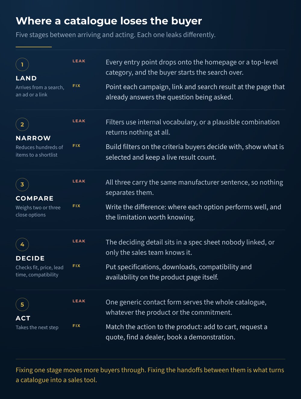
    Diagram of five stages a catalogue buyer moves through, land, narrow, compare, decide and act, with the common failure and the fix at each stage.
    Most catalogues do not fail in one place. They lose a share of buyers at each handoff, and the fixes are different at every stage.

    Build a category structure that feels predictable to someone outside the company. Keep top-level choices broad enough to scan, then let subcategories and filters handle specificity. Breadcrumbs can help visitors understand where they are within a large catalogue and move back through the hierarchy. Google also explains how breadcrumb markup can communicate page position in search results.

    Test the draft structure with realistic tasks. Ask someone unfamiliar with the database to find a product for a specific use case. Watch where they pause, which terms they misunderstand and whether they choose the route the team expected.

    Create a reliable product data model

    Large catalogues become difficult to manage when each product record follows a different pattern.

    Define the information every product type needs before building templates. Depending on the business, the data model may include:

    • Product name and model number
    • Category and subcategory
    • A short summary written for the buyer
    • Key specifications
    • Compatible products or systems
    • Available sizes, colours or materials
    • Product images and diagrams
    • Pricing or quote requirements
    • Availability and lead time
    • Downloads, manuals or safety sheets
    • Warranty, shipping or return details

    Some fields will apply only to certain categories. Keep shared fields consistent wherever possible so products can be filtered, compared and updated reliably.

    Data standards matter just as much as field selection. Decide how measurements are formatted, which abbreviations are acceptable and how product names are written. Establish a source of truth for pricing, inventory and model information. Document who owns each field and how updates reach the website.

    This foundational work protects the catalogue from becoming inconsistent again six months after launch.

    Make filters reflect meaningful differences

    Filters should help buyers reduce a large set of choices using criteria they understand.

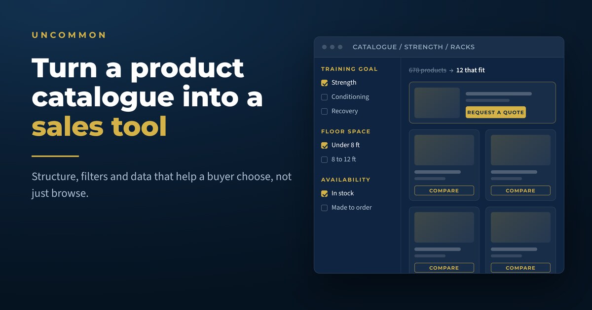
    For a fitness equipment catalogue, useful filters might include equipment type, training goal, available space, price range or brand. An industrial catalogue may need voltage, material, load rating, dimensions or compatibility.

    Every filter should represent a meaningful distinction in the decision. Avoid showing filters that produce empty or nearly identical result sets. Use clear labels, show selected options and make it easy to remove a filter without starting over.

    The Baymard Institute’s product-list and filtering research is based on thousands of usability-testing sessions and extensive benchmarking of leading ecommerce sites. Its work shows how much deliberate user-experience planning sits behind product lists that feel simple to use.

    Mobile behaviour deserves its own testing. Filters that work comfortably in a desktop sidebar may need a different presentation on a phone. Selected options should remain visible, and the results count should help users understand whether they have narrowed the list too far.

    Buyers who know what they want often go directly to the search bar. Catalogue search needs to understand more than exact product names.

    Plan for common abbreviations, model numbers, spelling errors and older terminology. Add synonyms when customers use a different phrase than the product database. Search results should reveal enough information to distinguish similar items without forcing visitors to open every page.

    Review searches that produce no results. They may reveal missing products, unfamiliar terminology or demand for information your site currently hides. Queries that receive many searches and few clicks can signal weak result labels or poor relevance.

    Search data can also guide future SEO and content work. A recurring non-product question may deserve a buying guide, glossary page or comparison article that links back into the appropriate catalogue category.

    Build product pages that support a decision

    A product page should answer the questions a buyer would ask before taking the next step.

    Start with a clear product name and a short explanation of who the item is for or what it helps them accomplish. Follow with scannable specifications, strong images and the information needed to evaluate fit.

    The page may also include:

    • Use cases or recommended applications
    • Compatibility details
    • Variant options
    • Delivery or installation information
    • Related accessories
    • Downloads and technical resources
    • Frequently asked questions
    • Proof from customers or completed projects

    Original product photography can make details easier to understand and give the catalogue a more consistent visual language. Uncommon’s photography and visual brand asset service can support product images, demonstrations and branded media for use across the website.

    Write descriptions that help a buyer distinguish the product from nearby alternatives. Repeating a manufacturer sentence across dozens of pages gives customers little guidance and creates weak search content. Explain the meaningful differences, the context in which each option performs well and any limitations a buyer should understand.

    Offer the right conversion path

    Some catalogue visitors are ready to buy. Others need pricing, technical confirmation or help choosing between similar products.

    Match the call to action to the product and the level of commitment required. Options may include:

    • Add to cart
    • Request a quote
    • Ask a product specialist
    • Find a dealer
    • Check availability
    • Book a demonstration
    • Download the specification sheet

    Use one visually dominant action on each template and place supporting actions nearby. Give buyers enough context to understand what happens after they click. Quote forms can mention the expected response time, while dealer finders can explain what information is needed to show local results.

    Keep forms focused on the information required for the next conversation. Long forms can be appropriate for complex products when each field has a clear purpose. Conditional questions can reduce clutter by showing detailed fields only when they apply.

    Once a form is submitted, marketing automation can route the inquiry, send the relevant resource and alert the correct salesperson. The confirmation page should explain the next step and provide a way to continue researching. If you are sending paid traffic into the catalogue, it is worth reading before you run ads, check the page people will land on first.

    Help search engines understand the catalogue

    A catalogue contains many pages with related terms, variants and attributes. Clear technical structure helps search engines find and interpret that content.

    Google’s ecommerce SEO guidance covers navigation, site structure, URLs and product data. Many recommendations also apply to catalogues where products are researched online and purchased through a dealer or sales representative.

    Important foundations include:

    • Crawlable links between categories and products
    • Descriptive, stable URLs
    • Unique page titles and descriptions
    • Useful category copy
    • Canonical handling for variants and filtered URLs
    • XML sitemaps that include active product pages
    • Redirect plans for discontinued or renamed products

    Structured data can give Google explicit information about a product. The correct implementation depends on whether the page supports a direct purchase, displays a product for research or represents several variants. Google provides separate guidance for product variants and merchant listings.

    Pagination and “load more” patterns also need technical planning. Google’s guide to pagination and incremental page loading explains how user-friendly display patterns can affect product discovery by crawlers.

    Web development and hosting should bring these search requirements into the build from the beginning. Repairing crawl paths and URL logic after hundreds of pages are live is far more disruptive.

    Protect speed and accessibility as the catalogue grows

    Product catalogues are vulnerable to slow pages because they rely on images, filters, third-party scripts and large databases.

    Compress images appropriately, use responsive image sizes and avoid loading every product asset at once. Test real category and product pages on mobile connections. The web.dev performance guidance explains how Core Web Vitals measure loading speed, responsiveness and visual stability from a user’s perspective.

    Accessibility should be built into templates and content workflows. Product images need useful text alternatives when they convey information. The W3C recommends using short alt text that communicates an image’s meaning or function. Form labels, keyboard navigation, colour contrast and visible focus states also need testing throughout search, filtering and conversion flows.

    A fast, accessible catalogue gives more buyers a dependable way to use the site. It also reduces the chance that future products inherit problems hidden inside the original template.

    Plan how the catalogue will stay accurate

    The launch date is the beginning of the catalogue’s operational life.

    Create a workflow for new products, revisions and discontinued items. Decide who approves copy, specifications, imagery and pricing. Establish what happens when an item is replaced by a newer model and which historical URLs should remain available for support or search demand.

    Where possible, connect the website to the system that already manages product information. An integration can reduce duplicate entry and prevent conflicts between the site, inventory platform and sales materials. Human review remains important for customer-facing descriptions, categorization and merchandising decisions.

    Schedule regular catalogue audits. Look for missing images, empty fields, broken downloads, outdated calls to action and products that have become difficult to reach through navigation. Analytics and internal search data can show where visitors struggle or abandon the process.

    Measure whether the catalogue supports sales

    Page views show activity. Sales-focused measurement reveals whether visitors are moving toward a useful outcome.

    Track the actions that match the catalogue’s purpose, such as:

    • Product-to-quote conversion rate
    • Add-to-cart and completed-purchase rate
    • Dealer-finder usage
    • Specification or catalogue downloads
    • Product comparison activity
    • Contact requests by category
    • Internal searches with no results
    • Revenue or qualified opportunities influenced by catalogue pages

    Review performance by category and traffic source. Highly technical products may attract fewer visitors while generating more valuable inquiries. Popular categories with weak conversion may need clearer selection guidance or a stronger next step.

    Connect website data to the CRM when the sales process continues offline. This helps the team see which categories generate qualified opportunities and which resources appear in successful buying journeys. It is the same principle behind a website that does more than exist politely online: the site has a job, and the job is measurable.

    What this looked like for Beyond the Basics Fitness

    Beyond the Basics Fitness needed to rebuild a catalogue containing 678 products. At that scale, the website had to do more than display inventory. Buyers needed a clear way to move through the range and find the information relevant to their decision.

    The rebuild treated structure as the product. Behind those 678 items sat 1,779 product images, 52 manufacturer brands, 42 categories and 181 tags, all of which had to be reconciled into one predictable taxonomy before a single template was designed. Because commercial fitness equipment is quote-driven rather than cart-driven, the primary action on a product page is a quote request, and buyers can gather several items into a shared wishlist before they contact the team. Legacy URLs were mapped through 1,447 redirects so the search visibility the old catalogue had earned survived the move.

    The project is a useful example of treating catalogue structure as part of the sales experience. Product organization, page templates and conversion paths need to work together when hundreds of individual records are involved.

    Explore the Beyond the Basics Fitness case study to see how Uncommon approached rebuilding a large catalogue as a practical sales tool.

    Product catalogue website checklist

    Use this checklist before a catalogue rebuild or major update:

    1. Define the primary action for each product type.
    2. Map how customers describe products and narrow their options.
    3. Create a consistent data model for every category.
    4. Standardize names, measurements and product attributes.
    5. Design filters around meaningful buying criteria.
    6. Improve search with synonyms, model numbers and common misspellings.
    7. Write descriptions that explain differences between similar products.
    8. Add useful images, specifications and downloads.
    9. Match calls to action to the buyer’s next step.
    10. Build crawlable categories, stable URLs and sensible variant handling.
    11. Test page speed, mobile usability and accessibility.
    12. Connect form submissions to a reliable follow-up process.
    13. Assign ownership for ongoing product updates.
    14. Measure qualified actions by product category.

    The best place to begin is the part of the catalogue that creates the most friction for customers or the most value for the business. Improving one high-priority category can reveal the data, content and development standards needed for the rest of the site.

    Build a catalogue that helps customers choose

    A large product range becomes easier to sell when the website helps buyers understand it. Clear structure, reliable data and useful decision support can turn a crowded catalogue into one of the strongest tools available to sales and marketing.

    Uncommon combines web development, SEO and automation to build catalogue experiences around how customers actually buy. Contact the Uncommon team to talk about rebuilding or improving your product catalogue website.

    Plan Your Catalogue Rebuild